JOMAS

A BEACON OF HOPE (Refusing to Look away.)

Supporting Africa's most vulnerable youth -the forgotten, the displaced the ones who fell through every crack We stand for dignity, community, and unyielding potential.

Our values

JOMAS is an open, inclusive space that welcomes adolescents and young people in their diversity. JOMAS is an open, inclusive space that welcomes adolescents and young people in their diversity.

Our Impact Stories

Born from the urgency of young people's needs. Numbers tell a story, but behind every statistic is a name, a face, and a future reclaimed from the margins.

Youth Workshops

JOMAS Foundation Africa is a youth-led nonprofit empowering young people across Uganda with sexual & reproductive health rights, education, and the tools to lead dignified lives.

OUR MISSION

Empowering communities through transformative education and youth livelihoods We create enabling environments where vulnerable children and youth can access opportunities that enhance their well-being and capacity to lead dignified, self-reliant lives.

Inclusivity

An open, welcoming space for all adolescents and young people in their diversity.

Intersectionality

Recognising how multiple identities shape access to rights and health services.

Bodily autonomy

Every individual's right to make decisions about their own body and future.

Justice

Every SRHR initiative must address racial, social and economic equity.

.ring1 { animation: cw 30s linear infinite; transform-origin: 300px 300px; } .ring2 { animation: ccw 22s linear infinite; transform-origin: 300px 300px; } .ring3 { animation: cw 16s linear infinite; transform-origin: 300px 300px; } .ring4 { animation: ccw 11s linear infinite; transform-origin: 300px 300px; } .ring5 { animation: cw 7s linear infinite; transform-origin: 300px 300px; } .center-spin { animation: cw 20s linear infinite; transform-origin: 300px 300px; } .center-pulse { animation: pulse 3.5s ease-in-out infinite; transform-origin: 300px 300px; } .glow-outer { animation: glow 4s ease-in-out infinite; transform-origin: 300px 300px; } .glow-inner { animation: glow 4s ease-in-out infinite reverse; transform-origin: 300px 300px; } .sparkle { animation: sparkle 2.5s ease-in-out infinite; transform-origin: 300px 300px; } @keyframes cw { from { transform: rotate(0deg); } to { transform: rotate(360deg); } } @keyframes ccw { from { transform: rotate(0deg); } to { transform: rotate(-360deg); } } @keyframes pulse { 0%,100% { transform: scale(1); opacity: 1; } 50% { transform: scale(1.12); opacity: 0.85; } } @keyframes glow { 0%,100% { opacity: 0.35; } 50% { opacity: 0.9; } } @keyframes sparkle { 0%,100% { opacity: 0.2; transform: scale(0.9); } 50% { opacity: 1; transform: scale(1.1); } }

Our work

Four programmes, one mission. From policy advocacy to women's economic empowerment and climate justice — our programmes address the full spectrum of young people's needs.

Youth Informed Voices

Using multimedia, social media and outreach to amplify young people's voices on SRHR across Uganda.

Primary Education On Sexuality

Comprehensive, youth-friendly sexuality education for young people both in and out of school.

Joint Talk Program

Advocacy and policy engagement to ensure young people's SRHR rights are embedded in national law and practice.

Women Arise Program

Economic, social and political empowerment for women and girls — including GBV survivors — through livelihoods and legal aid.

Our Impact

0 +

Reached 1,020,0321 Young People in and out of Schools with HIV/AIDS awareness and counseling services and information.

0 +

Reached 121,236 adolescent girls in schools with Menstrual Hygiene Information and emergency kits.

0 +

Distributed 1,000,000 condoms (950,000 male and 50,000 female condoms) among at risk young people and communities (young sex workers).

0 +

Sensitized 60,123 young people (boys and girls) on Self-Care Sensitization Sessions

.ring1 { animation: cw 30s linear infinite; transform-origin: 300px 300px; } .ring2 { animation: ccw 22s linear infinite; transform-origin: 300px 300px; } .ring3 { animation: cw 16s linear infinite; transform-origin: 300px 300px; } .ring4 { animation: ccw 11s linear infinite; transform-origin: 300px 300px; } .ring5 { animation: cw 7s linear infinite; transform-origin: 300px 300px; } .center-spin { animation: cw 20s linear infinite; transform-origin: 300px 300px; } .center-pulse { animation: pulse 3.5s ease-in-out infinite; transform-origin: 300px 300px; } .glow-outer { animation: glow 4s ease-in-out infinite; transform-origin: 300px 300px; } .glow-inner { animation: glow 4s ease-in-out infinite reverse; transform-origin: 300px 300px; } .sparkle { animation: sparkle 2.5s ease-in-out infinite; transform-origin: 300px 300px; } @keyframes cw { from { transform: rotate(0deg); } to { transform: rotate(360deg); } } @keyframes ccw { from { transform: rotate(0deg); } to { transform: rotate(-360deg); } } @keyframes pulse { 0%,100% { transform: scale(1); opacity: 1; } 50% { transform: scale(1.12); opacity: 0.85; } } @keyframes glow { 0%,100% { opacity: 0.35; } 50% { opacity: 0.9; } } @keyframes sparkle { 0%,100% { opacity: 0.2; transform: scale(0.9); } 50% { opacity: 1; transform: scale(1.1); } }

Our Sponsor program

Every contribution builds a foundation for vulnerable youth. Stand with us in the African sun and be part of their story, Get in touch with us today to see how you can make a difference

Our Voluteer Program

We would not be able to do what we do without the energy and enthusiasm of our volunteers. We are always looking for people who would like to help us. Whether that be offering support through your expertise or helping us to fundraise, we will have a fantastic and interesting role for you!

Our Partners

.ring1 { animation: cw 30s linear infinite; transform-origin: 300px 300px; } .ring2 { animation: ccw 22s linear infinite; transform-origin: 300px 300px; } .ring3 { animation: cw 16s linear infinite; transform-origin: 300px 300px; } .ring4 { animation: ccw 11s linear infinite; transform-origin: 300px 300px; } .ring5 { animation: cw 7s linear infinite; transform-origin: 300px 300px; } .center-spin { animation: cw 20s linear infinite; transform-origin: 300px 300px; } .center-pulse { animation: pulse 3.5s ease-in-out infinite; transform-origin: 300px 300px; } .glow-outer { animation: glow 4s ease-in-out infinite; transform-origin: 300px 300px; } .glow-inner { animation: glow 4s ease-in-out infinite reverse; transform-origin: 300px 300px; } .sparkle { animation: sparkle 2.5s ease-in-out infinite; transform-origin: 300px 300px; } @keyframes cw { from { transform: rotate(0deg); } to { transform: rotate(360deg); } } @keyframes ccw { from { transform: rotate(0deg); } to { transform: rotate(-360deg); } } @keyframes pulse { 0%,100% { transform: scale(1); opacity: 1; } 50% { transform: scale(1.12); opacity: 0.85; } } @keyframes glow { 0%,100% { opacity: 0.35; } 50% { opacity: 0.9; } } @keyframes sparkle { 0%,100% { opacity: 0.2; transform: scale(0.9); } 50% { opacity: 1; transform: scale(1.1); } }

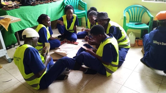
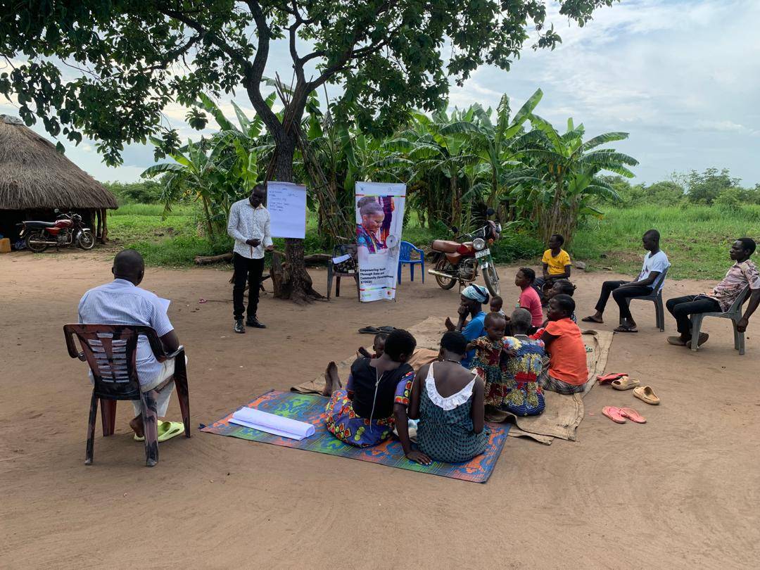
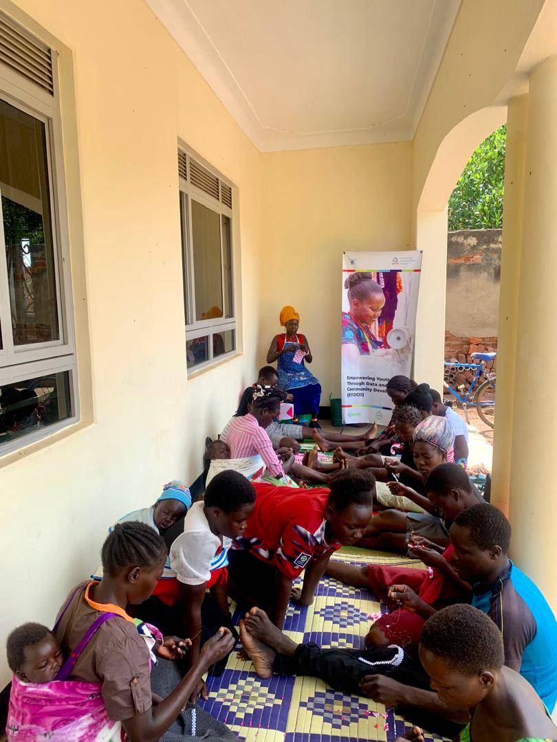
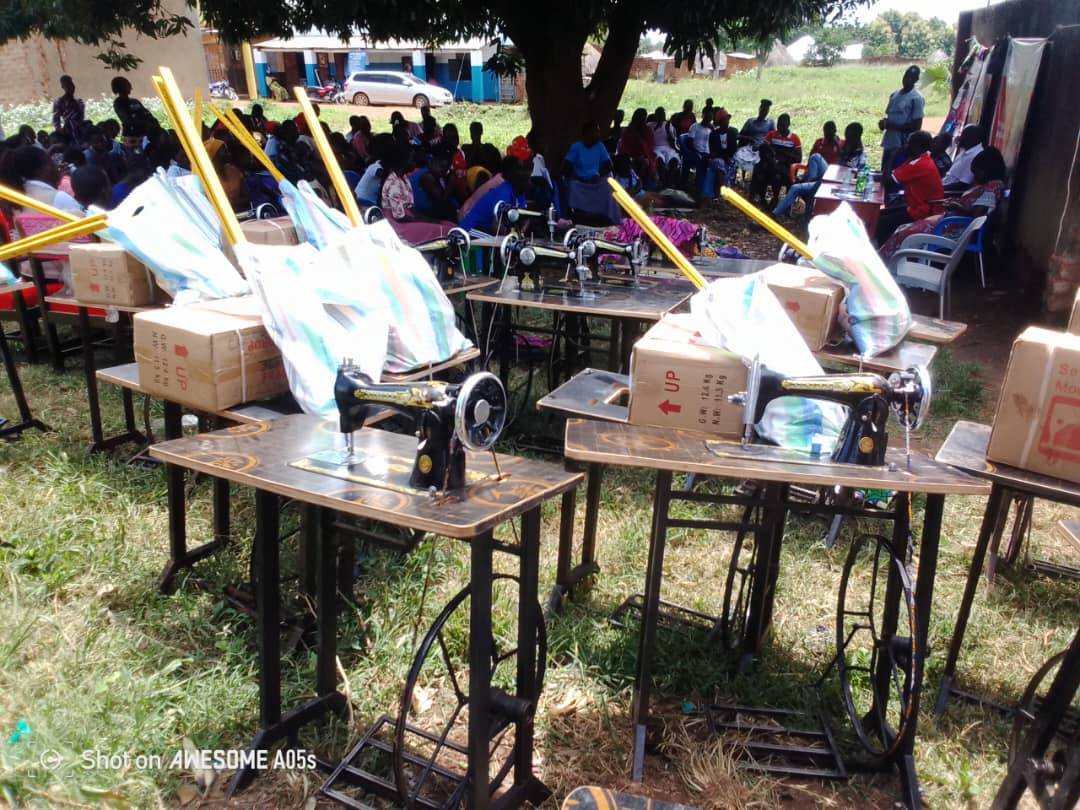
Empowering young people

Our core target constituency that we support include: In-and Out-of-Youth in their diversity aged 10 – 24 years and these are: Young People, Young PLHIV, Young PWDs, Young Fathers, Young Mothers, Young AGYW (Adolescent girls and young women), most-at-risk at work, Young Sex Workers, Young PWUDs, AGYW at risk of commercial sexual exploitation, Young Survivors of Violence, Torture and Conflict. We work with health workers, paramedics, counselors and other staff related to health issues, teachers, students, media personnel, environmentalists and stakeholders in the field of health, sexuality education, formal and non-formal education and environment/climate change

Latest News

From our work on the ground

Advocacy

JOMAS engages Parliament on SRHR policy amendments for young people

Programmes

Women Arise: GBV survivors trained in business development and VSLA formation

Education

Peer educators trained to deliver sexuality education to young people with disabilities

Climate

Youth-led climate action hubs launch green entrepreneurship training in rural Uganda

subscribe to our updates

Name

let's Stand Together

Support Our Activities By a Donation